Unity, a well-known game development technology, has given developers the ability to create immersive and graphically attractive environments. However, a smooth gaming experience is largely dependent on the user interface (UI), not just the 3D characters and environments. We’re here in this detailed guide to help newcomers understand the mysteries of Unity UI. We’ll cover everything, from creating interactive elements to maximising performance to comprehending the UI hierarchy. By the conclusion, you’ll have the tools you need to develop engaging user interfaces that engage players and improve the overall quality of your games. Together, let’s go out on this adventure to master Unity UI.
Table of Contents
Understanding Unity UI
Understanding Unity UI is important for game developers because it is used to create the user interface for games and applications. With Unity UI, you can create, show, and interact with a variety of game elements, including sliders, buttons, text, and images.
The Canvas
The Canvas is the core component of Unity’s user interface. Consider it a container for all your UI elements. It’s just a 2D plane where you set your user interface components. In a scene, Unity allows many Canvases, and you can adjust their rendering order and render modes. A summary of the Canvas is provided below.
Render Mode: Canvases can be rendered in three ways: Screen Space – Overlay, Screen Space – Camera, and World Space. Each mode has a specific use.
Sorting Layer: To manage the order in which your UI elements render, you can set sorting layers for them within the Canvas. Elements in higher sorting layers are rendered on top of elements in lower layers.
UI Elements
Unity includes a number of built-in UI elements that you may utilise to design your interface. Typical UI components consist of:
- Text: To display text, labels, or instructions.
- Image: For showing images or icons.
- Button: For user interaction through clicks or taps.
- Input Field: Allows users to enter text or numbers.
- Slider: Useful for adjusting values within a range.
- Dropdown: Creates dropdown menus for selection.
- Scroll View: For displaying scrollable content like lists or inventories.
These elements are simple to add to your Canvas and may be customised to meet the look and functionality of your project.
RectTransform
Understanding RectTransform is necessary for positioning and scaling UI elements on the Canvas. It’s in charge of an element’s position, size, and pivot point. RectTransform key concepts include:
- Anchors: They explain how the position of an element on the Canvas is related to it. Anchors are set in percentages, so elements scale with the Canvas.
- Pivot: The element’s rotational and scaling point is determined by its pivot point.
Event System
In order to manage user interactions with UI elements, Unity’s Event System is essential. Events such as mouse hovers, button presses, and touch interactions are recorded. You can set up the Event System to send events to specific GameObjects, like user-input responding scripts.
Unity UI Best Practices
It’s critical to keep the following best practises in mind when learning Unity UI:
- Consistency: To improve user experience, keep your UI elements consistent in both style and layout.
- Performance: Pay attention to UI performance, particularly in complex scenes with a lot of UI elements. Make use of optimisation strategies like batching and raycast minimisation.
- User Testing: Make sure your user interface (UI) is intuitive and easy to use by testing it with prospective users.
The Unity UI Hierarchy
The Unity UI Hierarchy is a key concept in Unity game development, particularly when working with user interfaces (UI). It shows the hierarchy of UI elements in your scene, and managing and arranging your UI elements efficiently depends on your ability to comprehend it. We will delve into the Unity UI Hierarchy in detail, covering its purpose, elements, and how to work with it.
- Purpose of the Unity UI Hierarchy:
Every UI element in your scene is represented visually by the Unity UI Hierarchy. It enables effective management, arrangement, and organisation of these components. It can be compared to a tree-like structure that illustrates the parent-child connections between UI elements. - Accessing the Unity UI Hierarchy:
Open Unity Editor and make sure you’re in the “Scene” view in order to access the Unity UI Hierarchy. All of the GameObjects in your scene, including UI components, are listed in the Hierarchy window. - GameObjects and UI Elements:
UI components are called GameObjects in Unity, and they are part of the same scene hierarchy as other game objects, such as lights, props, and characters.Button, text field, and image UI elements are specialised components that are added to these GameObjects. - Parent-Child Relationships:
It is possible to arrange UI elements in a hierarchy with parent-child connections. There are various advantages to this organising system:- The scale, rotation, and position of child elements can be managed by parent elements.
- Child elements inherit their parent’s transformations (position, rotation, and scale).
- Hiding, moving, or modifying a parent will have an impact on all of its children.
- Creating UI Elements in the Hierarchy:
Right-click in the Hierarchy window and select “UI” to add a new UI element. Then, you can select from a variety of UI element types, including Image, Text, Button, Canvas, and so forth. The new UI component will show up in the Hierarchy as a child of the Canvas. - Navigating and Managing the Hierarchy:
To edit or modify UI elements, you can select them directly in the Hierarchy. The “Create Empty” buttons allow you to create an empty GameObject that can hold UI components. Drag and drop within the Hierarchy to reorder elements, which can change the rendering order of UI components (affecting what is displayed on top). - Layering and Sorting Order:
Which UI elements are shown first in Unity UI is determined by a sorting order. For proper UI element layering, this is essential. The higher the sorting order value, the closer the element will be to the viewer. Each UI element’s sorting order can be changed in the Inspector window. - Complex UI Structures:
In the Unity UI Hierarchy, complex UIs frequently require multiple layers of parent-child relationships. To create complex UI designs, UI elements can be nested within other UI elements. The proper organisation of UI elements facilitates easier management and updates of your UI as your project expands.
Basic UI Elements
Now let’s examine in more detail a few fundamental Unity user interface components. When designing a user interface for an application, game, or interactive experience, these components are essential.
- Text:
Text is a basic user interface element that displays the user information. It can be applied to any textual content in your game or application, including dialogue, labels, and instructions. To create a text element, navigate to the Hierarchy panel in the Unity Editor. Right-click, choose UI, then select Text.
- Key Properties:
- Text content: You can change the text content directly within the Text component.
- Font and typography: The font’s alignment, size, colour, and style are all customizable.
- Usage Example: To display the player’s score, character names, or any in-game messages, use Text.
- Key Properties:
- Image:
Graphical elements used for visual representation in user interfaces are called images. They can be used for icons, logos, backgrounds, and other static images. To create a image element, navigate to the Hierarchy panel in the Unity Editor. Right-click, choose UI, then select Image.
- Key Properties:
- Sprite: To the Image component, you can assign a sprite image.
- Color and transparency: M odify the colour, transparency, and blend mode of the image.
- Usage Example: For background images, menu icons, and character portraits, use images.
- Key Properties:
- Button:
Buttons are interactive UI elements that perform actions when clicked. They are necessary for your application or game’s navigation and user input. To create a button element, navigate to the Hierarchy panel in the Unity Editor. Right-click, choose UI, then select Button.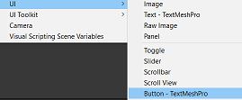
- Key Properties:
- Text and Image: Buttons can contain text and/or images as content.
- Click events: You can specify scripts or functions that execute when the button is pressed.
- Usage Example: Create buttons for starting the game, opening a menu, or confirming actions.
- Key Properties:
- Input Field:
Users can enter text or numbers into input fields. They come in useful for text-based interactions, search bars, and user registration. To create a Input Field element, navigate to the Hierarchy panel in the Unity Editor. Right-click, choose UI, then select Input Field.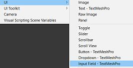
- Key Properties:
- Placeholder text: Give users guidance or instructions.
- Character limits: You can specify the maximum number of characters allowed.
- Validation: To verify input data, add custom scripts.
- Usage Example: Use input fields to enter chat messages, player names, and search terms.
- Key Properties:
- Slider:
Sliders are used to select values from a range. They are perfect for controlling volume, adjusting settings, and making other numerical options. To create a Slider element, navigate to the Hierarchy panel in the Unity Editor. Right-click, choose UI, then select Slider.
- Key Properties:
- Min and Max values: Specify the slider’s range.
- Current value: Get or set the current selected value.
- Usage Example: Use sliders to adjust the character attributes or the volume of the in-game music.
- Key Properties:
- Toggle (Checkbox):
Binary controls known as toggles are used to enable or disable various features and settings. They work well for preferences, options, and switching between different game mechanics. To create a Toggle element, navigate to the Hierarchy panel in the Unity Editor. Right-click, choose UI, then select Toggle.
- Key Properties:
- Label: To describe the toggle function, add a label.
- Interactable: Depending on the game logic, enable or disable the toggle.
- Usage Example: Use toggles to turn on or off sound effects, switch between full-screen and portrait modes, or activate “night mode.”
- Key Properties:
When working with these basic UI elements in Unity, you can easily customise their appearance and behaviour by using the Unity Inspector or scripts.
Layout and Positioning
Layout and positioning play an essential role in ensuring that the elements in your Unity UI are correctly presented and interact well with different screen sizes and resolutions. This is essential for designing a responsive and user-friendly UI.
The arrangement and sizing of UI elements within a Unity Canvas are referred to as layout and positioning. To create a professional and eye-catching user interface, proper layout and positioning are essential. Unity has a variety of tools and components to assist you with this, and understanding them is essential for UI design.
- RectTransform:
The foundation of Unity UI layout and positioning is the RectTransform. It specifies the orientation, dimensions, and rotation of an element inside a Canvas. RectTransform’s key properties are as follows:- Position: This is given in pixels, and you can find out how it’s calculated in relation to the parent object by using anchors.
- Size: The element’s width and height are expressed in pixels by its size.
- Rotation: The element can be turned around its pivot point.
- Pivot and Anchors: When the parent element’s size changes, the anchor determines how the element repositions and resizes. The point that an element rotates around is specified by a pivot.
- Anchoring:
Anchors are used to manage how an element repositions and resizes in response to size changes made by the parent object, which is often a Canvas or Panel. Custom and preset anchor options are also offered by Unity. Presets like Top-Left, Centre, Stretch, etc. are frequently used. Anchors make ensure that when your UI elements adjust to different screen resolutions, they keep their relative sizes and positions. - Layout Groups:
Child UI elements can be automatically arranged with the help of layout group components offered by Unity, such as the Vertical Layout Group and Horizontal Layout Group. To create responsive designs, these elements are necessary. To keep your user interface (UI) consistent, you can adjust the padding, child control settings, and spacing between items. - Content Size Fitter:
When you want an element to automatically change size depending on its content, you can use the Content Size Fitter component. This is useful for elements that need to resize or expand in accordance with the size of their content, such as text fields, buttons, or panels. - Aspect Ratio Fitter:
This component makes sure that when an element is resized, it keeps a specific aspect ratio. This is especially helpful for elements and graphics where proportions are important. - Grid Layout Group:
To arrange UI elements in a grid pattern, use the Grid Layout Group. The amount of rows and columns, as well as the padding and cell spacing, are all customizable. For making grids of buttons, pictures, or other UI elements, it’s perfect. - Best Practices:
When working with layout and positioning in Unity UI, keep the following recommended practises in mind:- Prepare your layout carefully: Consider how the components are arranged and how they will adjust to various screen sizes.
- Use anchors wisely: Anchors help elements adjust to changing resolutions, but wrong implementation might result in undesired scaling and stretching.
- Test with different screen sizes: With Unity’s Play Mode, you can test your user interface across a range of screens and resolutions to make sure it looks well everywhere.
- Be aware of performance: Complex layouts and a large number of UI elements might degrade speed, therefore optimise your design for efficiency.
You will be able to create UIs for your games and applications that are both visually beautiful and responsive if you have a solid understanding of anchors, layout groups, the RectTransform, and other components.
User Interaction
The handling of UI events in Unity is a critical component in creating interactive user interfaces. The Event System in Unity enables developers to react to a range of user input events, including mouse hover events and button clicks.
UI Event Handling and the Event System
In Unity, the Event System is responsible for managing and distributing UI events.These events comprise touch, keyboard, and mouse input. These events are handled by UI components including input fields, sliders, and buttons. This is how it works:
- Event System: A GameObject in Unity, the Event System keeps track of input events and distributes them to the appropriate UI components. It is useful for managing interactions with UI components.
- Event Trigger: There is an Event Trigger component on every UI element that lets you specify which events (like Pointer Click, Pointer Enter, and Pointer Exit) it should react to.
Setting Up the Event System
Please make sure the Event System is configured in your scene before proceeding with any work with it. Navigate to “GameObject” > “UI” > “Event System” in the Unity editor to accomplish this. The Event System is required for capturing and dispatching UI events.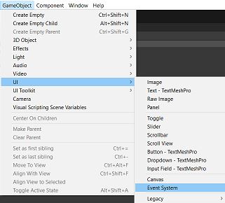
Responding to User Input
Now consider how you can use code to respond to user input. We will go over mouse hover events and button clicks.
- Button Click Events
One of the most popular ways to engage with games and apps is to click buttons. The following describes how to use C# code to react to a button click:- Create a UI Button: A button can be created using the Unity Editor or programmatically by using code.
- Add an Event Trigger: Click the “Add Component” button in the Inspector after selecting the button in the Unity Editor to add an Event Trigger component. Here, you can define the event to which you want to respond, such as “Pointer Click.”
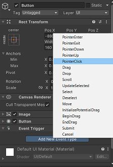
- Write a C# Script: To handle the button click event, write a C# script. Attach this script to the GameObject button.
using UnityEngine;
using UnityEngine.UI;

public class ButtonClickHandler : MonoBehaviour
{
    public Text feedbackText;

    public void OnButtonClick()
    {
        feedbackText.text = "Button Clicked!";
    }
}
In this example, when a button is clicked, a ButtonClickHandler script changes the text of a UI Text element to “Button Clicked!”
- Mouse Hover Events
When the mouse cursor enters or exits a UI element, it is detected using mouse hover events. To react to a mouse hover event, follow these steps:- To detect hover events on a UI element, add an Event Trigger component to it.
- Set the “Pointer Enter” and “Pointer Exit” events to for the Event Trigger component to respond.
- In order to handle the hover events, write a C# script:
using UnityEngine;
using UnityEngine.UI;
using UnityEngine.EventSystems;

public class HoverHandler : MonoBehaviour, IPointerEnterHandler, IPointerExitHandler
{
    public Text feedbackText;

    public void OnPointerEnter(PointerEventData eventData)
    {
        feedbackText.text = "Mouse Enter!";
    }

    public void OnPointerExit(PointerEventData eventData)
    {
        feedbackText.text = "Mouse Exit!";
    }
}
To respond to mouse entry and exit events, the HoverHandler script in this example implements the IPointerEnterHandler and IPointerExitHandler interfaces. The UI Text element is updated accordingly.
Applying Event Trigger and Scripts
Configure the Event Trigger component on the UI elements as necessary, and attach the C# scripts to the appropriate GameObjects. To specify which functions to call in response to certain events, use the Unity Editor.
You may respond to user input events in Unity’s UI system, such as button clicks and mouse hover events, by following these instructions and using code examples.
UI Animation
For UI design to improve user experience and engagement, animation is essential. It guides users through transitions and interactions by giving them visual feedback. Effective animations increase usability and decrease errors by making the user interface (UI) more intuitive. They connect various UI elements and communicate hierarchy by establishing a sense of continuity. Additionally, animation gives static interfaces a dynamic and clear component that enhances their interaction and modern feel. It can communicate emotions, highlight significant content, and announce status updates. To summarise, animation is more than just eye candy; it is a powerful tool for successful communication, user retention, and overall user satisfaction.
Unity’s Animation and Animator Components for UI Animation
Unity provides two primary components for creating UI animations:
- Animation Component:
- UI elements can be directly animated using the Animation component.
- It works well for straightforward animations in which you wish to change a UI element’s position, scale, rotation, or colour.
- To manage the motion and timing of the animation, you can use keyframes and animation curves.
- Animator Controller:
- Because of its greater versatility, the Animator component is usually utilised for complex UI animations with multiple states.
- You can use it to build a state machine that controls the transitions and states of various animations.
- Animator controllers are ideal for gaming character selecting screens and menu systems.
Step-by-Step Instructions on Creating Basic Animations in Unity UI
Let’s see how to use Unity’s Animation component to create a simple animation for a UI element:
- Select the UI Element:
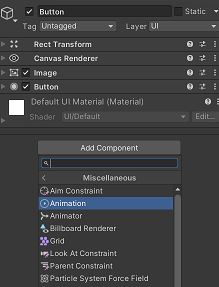
Select the UI element (e.g., a button) that you wish to animate in the Unity Editor. - Add the Animation Component:
- Select “Add Component” from the Inspector window and search for “Animation.”
- To add the Animation component to your UI element, click on “Animation”.
- Create Animation Clips:
- Click “Create” to start creating a new animation clip in the Animation window.
- Rename the animation clip something relevant.

- Add Keyframes:
- Select your UI element in the Animation window.
- Add keyframes, adjust the UI element’s position or scale, and move the playhead to a specific time.
- To make your animation, repeat these steps at different intervals of time.

- Define Animation Curves:
- You can change the animation curves to customise the speed and interpolation of the animation.
- Play and Preview:
- Use the Animation window to preview your animation.
- Attach the Animation to a Trigger:
- The animation can be made to play, pause, or stop in response to user input by using scripts or other UI events.
Building a Sample UI
Building a simple UI for a game or application in Unity, step by step. We’ll build a simple game’s “Start Menu” user interface in this example. The title, the play button, and the exit button will be on this user interface.
Step 1: Create a New Canvas
- Open your Unity project.
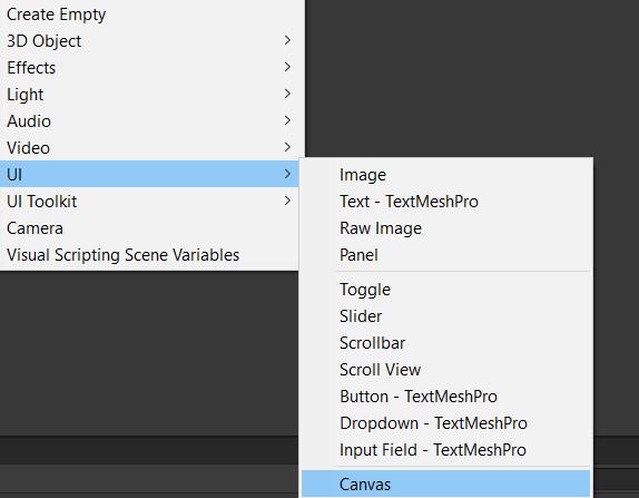
- To create a new canvas, right-click in the Hierarchy panel and select “UI” > “Canvas”. The canvas is the container for all UI elements.
Step 2: Design the UI Elements
- Right-click in the Hierarchy panel when the canvas is selected and select “UI” to create UI elements such as Text, Buttons, and Images.
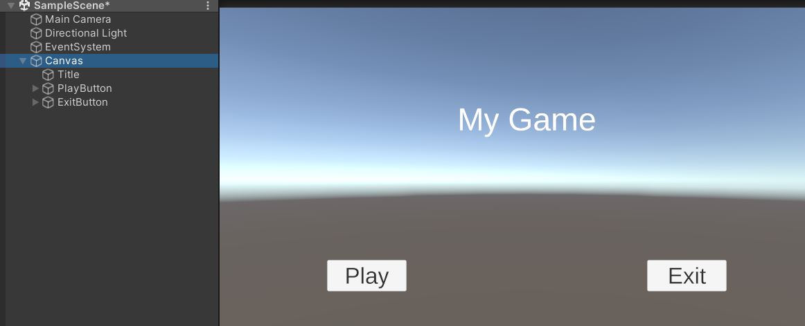
- Change the Text element’s name to “Title” and its text to “My Game.”
- Change the first button’s name to “PlayButton” and the text to “Play.”
- Change the second button’s name to “ExitButton” and its text to “Exit.”
Step 3: Position and Style the UI Elements
- Go to the Inspector panel, select the Title Text element, and change the alignment, size, and font.
- Do the same for the Play and Exit Buttons, customising their appearance as desired.
- To arrange elements on the canvas, use the RectTransform component. In the Unity editor, position values can be manually entered or you can use the drag-and-drop functionality.
Step 4: Add Functionality to UI Elements
- Write your UI script in C#. In the Assets panel, use the right-click menu to select “Create” > “C# Script.” Call it “MainMenuUI” or a similar name.
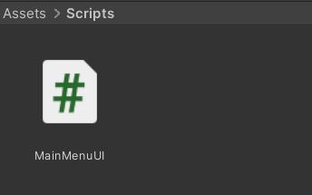
- Drag and drop the MainMenuUI script from the Assets panel into the Hierarchy panel to attach it to the canvas.
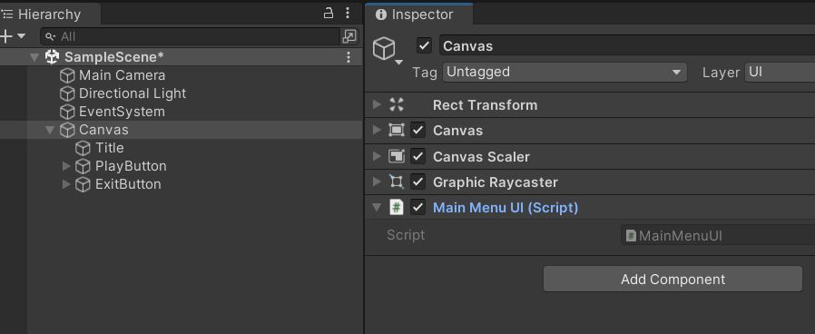
- To open the script in your preferred code editor, double-click on it.
Step 5: Scripting Functionality for the Play Button
Here’s a sample script for the Play button:
using UnityEngine;
using UnityEngine.UI;
using UnityEngine.SceneManagement;

public class MainMenuUI : MonoBehaviour
{
    public Button playButton;

    void Start()
    {
        // Add an event listener to the Play button
        playButton.onClick.AddListener(PlayGame);
    }

    void PlayGame()
    {
        // Load the game scene
        SceneManager.LoadScene("GameScene");
    }
}
Step 6: Scripting Functionality for the Exit Button
Here’s a sample script for the Exit button:
using UnityEngine;
using UnityEngine.UI;

public class MainMenuUI : MonoBehaviour
{
    public Button exitButton;

    void Start()
    {
        // Add an event listener to the Exit button
        exitButton.onClick.AddListener(ExitGame);
    }

    void ExitGame()
    {
        // Quit the application (only works in standalone builds)
        Application.Quit();
    }
}
Step 7: Link UI Elements to the Script
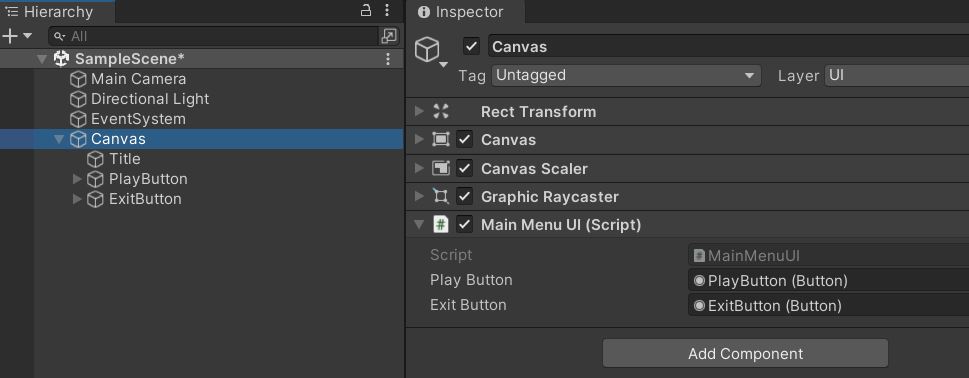
- Select Canvas in the Unity editor.
- Slots for the Play and Exit buttons are situated in the Inspector panel. In these slots, drag and drop the corresponding user interface elements from the Hierarchy panel.
Step 8: Testing
- Go back to Unity after saving your script.
- When you click the “Play” button, make sure you have a “GameScene” or a suitable scene to load.
- To make sure everything works as it should, run your game and play around with the UI elements.
Step 9: Build Your Game
- Once your game is ready, you can build it for your target platform (e.g., PC, mobile, etc.) using Unity’s build settings.
Finally, this blog post encourages newcomers to experiment with and learn about UI design in Unity. It emphasises the significance of user interface (UI) in improving user experience in games and applications, as a well-designed UI may have a significant impact on how users interact with and enjoy the software.
